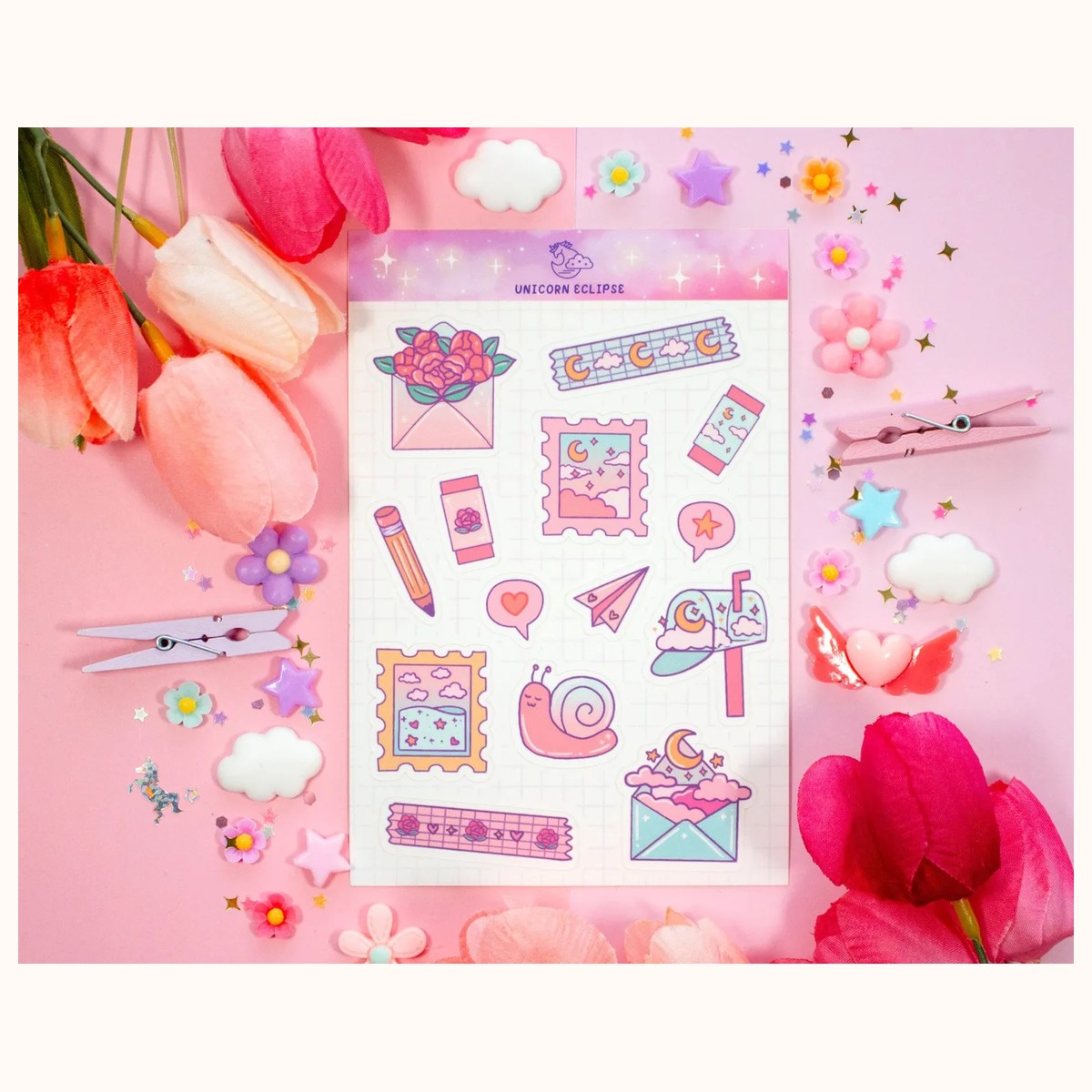

Small shelves do not have to make a stationery selection feel crowded. The most effective stationery retail display ideas use a simple visual order: shoppers can see what a product is, understand how it might be used, and reach it without disturbing everything nearby. That matters whether you run a counter display, a narrow wall unit, or a compact wholesale-facing showroom.
The goal is not to fill every gap. It is to make each shelf earn its space while leaving enough room for hands, labels, and restocking. Start with products that naturally suit small footprints—sticker sheets, sticky notes, washi tape, bookmarks, and note cards—then build displays around browsing behavior rather than around a random mix of designs.
1. Plan the shelf by shopper mission
Before choosing containers or signs, decide what a shopper should be able to do in each section. A compact shelf usually works best when each vertical zone answers one question, such as “What can I use for planning?” or “What is an easy add-on?” Mixing every stationery type together may look colorful, but it makes comparison slower and hides useful differences.
Group by use, then by format
Create broad use-based zones first:
- Plan and organize: sticky notes, checklist pads, memo pads, and note cards.
- Decorate paper projects: sticker sheets and washi tape.
- Read and carry: bookmarks and pencil cases.
- Small add-ons: compact magnets or keychains near the checkout area, if the shelf serves gift shoppers as well as stationery shoppers.
Within each zone, keep similar formats together. For example, place 3 x 3 inch sticky-note pads in one row and 3 x 5 inch note cards in another instead of alternating them. This gives the eye a repeatable pattern and makes low-stock gaps obvious.
A real example is the Straight-a-student Check List Cute Aesthetic Sticky Notes. Its checklist format has a clear purpose, so it belongs beside other planning products rather than buried among decorative stickers. The Starry Clouds Note Cards can sit in a “write, study, and organize” zone because its 3 x 5 inch format is easy to recognize and compare with other note cards.
Use vertical space deliberately
On a tall shelf, reserve the most eye-level band for the product type you most want shoppers to notice. Put heavier or deeper items lower down, and keep small loose items in shallow trays so they do not disappear at the back. Use the top band for a single category sign or a few front-facing examples rather than a dense second row.
If customers must stretch, crouch, or pull out several items to read labels, the arrangement is too ambitious. Test every row with one hand: a shopper should be able to remove one item and return it without causing a cascade.
2. Make small products read clearly from a distance
Compact stationery often has a small visual footprint, so display clarity matters more than quantity. A shopper approaching the shelf should see category, design, and price—or know exactly where to find those details—before picking up an item.
Face the best examples forward
Use front-facing product cards, packets, or rolls as “signposts.” For sticker sheets, face two or three designs forward and place duplicates behind them. For washi tape, display rolls in a shallow upright row or in small compartments that let the pattern remain visible. Avoid laying rolls flat in a stack unless shoppers can lift the top roll without losing the sequence.
A themed grouping can be more legible than a color-only grouping. For instance, place Paper Planes and Boats Washi Tape, City Skyline Washi Tape, and Coffee Shop Kawaii Aesthetic Washi Tape in one decorative-tape run, while keeping each roll’s name and price visible. The themes invite browsing, but the repeated 15 mm by 10 m format keeps the shelf visually consistent.
Build a clear price and information system
Choose one label position and repeat it across the whole shelf: below the product, on a tray edge, or on a small holder. Do not make shoppers search behind products for price information. If designs have different prices, use individual labels; if a group shares one price, place a group label directly above it and make the boundary unmistakable.
Keep signage short. “3 x 3 sticky notes,” “4 x 6 sticker sheets,” or “15 mm washi tape” is more useful than a decorative paragraph. Product details can be checked on the wholesale collection, and shoppers who need business or catalog verification can use the contact page. Never imply that similar-looking items have identical specifications without checking the product listing.
Avoid the “wall of art” problem
A colorful shelf can become visually noisy when every item faces forward. Create rhythm by alternating small blocks: three sticker sheets, a narrow sign, three more sheets, then a tray of sticky notes. Leave a little background space around a featured design. This gives the eye a stopping point and helps one product act as an anchor without making the rest look unavailable.
If customers keep asking what a display is, add a category header. If they ask where the price is, fix the label placement. Those questions are useful troubleshooting signals: the shelf is communicating less clearly than the product itself.
3. Design compact displays that support add-on buying
Good cross-merchandising should feel like a helpful next step, not a forced bundle. On a narrow shelf, connect products by task or project so one small item explains why another belongs nearby.
Create “project pairs”
Place complementary items within one reach, but keep their categories visually distinct. Try combinations such as:
- a sticker sheet beside washi tape for planner decorating;
- a sticky-note pad beside note cards for lists, study prompts, or quick messages;
- a bookmark beside a pencil case for a reading or school-themed mini display;
- a decorative magnet beside a small memo pad for reminders at home or work.
For example, a Writer Aesthetic Cute Sticky Note Memo Pad can sit beside note cards with a small “quick notes” sign. The pairing suggests a use without claiming the items are a formal set. Keep the most frequently handled item in the easiest position to reach and place the companion item beside it, not behind it.
Use trays, risers, and dividers with a purpose
A shallow tray prevents loose pads from sliding backward. A low riser can lift the back row enough for labels to remain visible. Dividers are useful when designs are similar, but too many dividers make a compact shelf feel fragmented. Use one divider per product family or theme, then let products within that family touch visually.
Check stability before opening hours or a busy selling period. If a riser makes the front row too close to the shelf edge, remove it. If a tray hides the bottom of a label, lower the label or choose a shallower tray. Display hardware should solve a visibility or access problem; it should not take more space than the stationery.
Reserve a small “new or featured” position
One front-facing featured position can refresh the shelf without requiring a complete redesign. Rotate it when the featured item sells down, when a season changes, or when shoppers stop noticing it. Keep the featured area small—one product family or a few coordinated designs—so it does not interrupt the main navigation.
For wholesale presentation, make the featured position easy to reset. Record the product name, shelf location, and minimum display quantity on a simple restocking note. That helps different staff members return products to the same place instead of gradually mixing categories.
4. Keep the shelf shoppable, measurable, and easy to reset
A compact display succeeds only if it remains tidy after real browsing. Build maintenance into the arrangement from the beginning rather than treating it as a final cleaning task.
Set a simple replenishment rule
Choose a minimum visible quantity for each item. For example, keep one front-facing sample and two backups for a small sticker sheet, or maintain a short row of identical washi rolls. The exact number depends on shelf depth and sales pace; the useful part is having a rule that prevents both empty-looking gaps and overfilled rows.
Check the shelf at a set rhythm: before opening, after a busy period, and whenever a staff member notices a category gap. Pull products forward, return misplaced items, straighten signs, and remove damaged packaging. Do not fill a gap with a different category just to make the shelf look full; that weakens the visual map.
Watch what shoppers do
For one week, note where people pause, what they pick up, and which questions repeat. If sticker sheets are frequently handled but rarely purchased, the problem may be unclear pricing, too many similar designs, or poor grouping—not necessarily the products. If a lower shelf sells better than an eye-level shelf, check whether it contains clearer labels or a more useful category.
Change one variable at a time. Move a category, revise a sign, or alter the number of front-facing samples, then observe the result before making another change. This makes the display easier to improve and prevents guesses from turning into permanent clutter.
Know when to reduce the range
When a shelf feels cramped, remove duplicates before removing whole categories. Keep the strongest variety of themes or uses, then store reserve stock elsewhere if available. A smaller, legible assortment often gives shoppers more confidence than a larger assortment that requires rummaging.
Finally, photograph the reset shelf for staff reference. Include the category labels and the intended order, but update the image whenever products or shelf dimensions change. For more catalog context, review the wholesale collection, and verify current product names and availability on the linked product pages rather than promising a particular stock level.
Related reading: How to Choose Stickers for Journals and Planners · 2026 Stationery Trends: Color, Texture, and Joy · The Future of Independent Stationery Shops