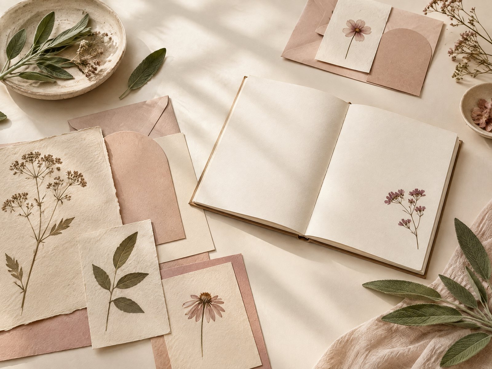
A botanical stationery choice can go wrong in a surprisingly ordinary way: the pieces are individually attractive, but together they look like unrelated samples from a crowded drawer. One leaf is delicate, another is oversized, and a third arrives in a completely different color family. The result is visual noise rather than a useful paper selection. Farouk Book Store offers a way to approach the problem as an edit: start with the plant-like quality you actually enjoy, then choose a few pieces that share a visual relationship without becoming a matching set.
This is a story about design choices, not a claim that Farouk created or manufactured the original catalog artwork. The shop’s catalog brings together different kinds of goods, so the most successful botanical grouping comes from comparing motif, scale, color, and intended setting. A notebook, a sticker sheet, and a small display piece can belong together because they repeat one idea at different intensities—not because they have to carry the same print.
Begin with the botanical idea, not the product type
“Botanical” can describe several very different moods. A thin stem and a single leaf feel airy and restrained. A dense flower cluster feels decorative and abundant. A recognizable monstera leaf is graphic and architectural, while a small floral pattern can read as soft background texture. Decide which visual sentence you want to make before opening several product pages.
For a quiet edit, choose one dominant shape: perhaps rounded leaves, simple stems, or small blossoms. Add a secondary shape only when it supports the first. If the anchor is a broad leaf, tiny dots or fine stems can act as punctuation; another large, detailed flower may compete for attention. This two-level rule is more useful than trying to match every shade exactly, especially when product photography, lighting, and screen settings can make colors appear different in person.
It also helps to name the intended feeling in practical terms. “A calm corner for writing” leads to different decisions from “a cheerful accent for a gift.” The first may need one muted cover and a small removable detail. The second can tolerate a brighter flower or a busier arrangement. Avoid treating a plant motif as a personality test. Someone may like a sunflower image because of its color, a fern because of its shape, or a flower simply because it suits a particular room. Let the known preference lead; do not infer more than the design shows.
The stickers, labels, and tags collection is a useful place to compare small botanical gestures with other formats. Look for the role each piece might play before deciding whether it belongs in the final group: focal image, border detail, label, or spare accent.
Build an edit around one anchor piece
An anchor is the item that establishes the scale and direction of the composition. For a writing-focused selection, the Botanical Bliss Spiral Lined Notebook (7x9\") is a natural starting point. Its floral-inspired cover, 7 x 9 in. format, 120 lined college-ruled pages, and spiral binding make it a substantial object rather than a tiny decoration. Use it as the visual reference, then ask what the supporting pieces should do: echo the plant language, provide contrast, or stay out of the way.
If the notebook is the anchor, keep the next item smaller in visual commitment. The [Blooming Records Sticker Sheet](/products/blooming-records-sticker-sheet) combines record-inspired and floral motifs on an 18-sticker, 4 x 6 in. matte sheet. It is not a literal match for a botanical notebook, and that is useful. The flower element can connect the two while the record forms introduce a deliberate change of rhythm. Place one or two stickers on a removable paper swatch first. If the floral details disappear beside the notebook cover, use the sheet as a supply for small labels rather than covering the notebook with a busy cluster.
A third option is to move the botanical motif away from the page entirely. The Monstera Suncatcher Sticker | Rainbow Maker Window Decal has a clear leaf-shaped role: it is a 4.25 x 6 in. water-resistant vinyl window decal intended for direct sunlight and removable, replaceable placement. Pairing it with a notebook creates a room-to-page connection, but it should not be described as stationery or treated like a sticker for every smooth surface. Its best contribution is a nearby visual echo—one leaf at the window, a restrained plant detail on paper.
This anchor-and-support method prevents a common failure: buying three products because each is “botanical” and then discovering that all three demand equal attention. If every piece is a focal point, remove one. If the group feels too plain, add a single high-contrast detail rather than a fourth pattern.
Pair motifs by scale, color, and visual distance
Scale is the first adjustment to test. Large leaves need breathing room. Small flowers can fill a narrow margin, but a whole sheet of them may become texture rather than imagery. Put the largest item at the back of your test layout, the medium item beside it, and the smallest accents last. Photograph the arrangement from a little distance. If the smallest motif vanishes, it may work as a close-up detail; if it dominates, reserve it for a single placement.
Color is the second adjustment, and it should be handled as a range rather than a hunt for an identical green. A sage or muted leaf can sit beside cream, pale blue, warm yellow, or soft pink if one of those colors appears in the surrounding object. Conversely, two greens can clash when one is gray and quiet while the other is saturated and glossy. Make a quick three-swatch test on scrap paper: the main color, the darkest line or outline, and one supporting color. If those three feel coherent, the edit has a better chance of holding together.
Visual distance matters as much as color. A printed notebook cover, a matte sticker sheet, and a window decal each reflect light differently and occupy different spaces. That difference can make a selection feel layered rather than repetitive. It can also create a mismatch. A highly detailed page may look awkward next to a single graphic leaf if there is no shared color or line quality. The fix is not necessarily another product. Try cropping the page view, using only one sticker, or placing the window element farther from the desk so the relationship becomes an echo rather than a collision.
One particularly useful decision is whether the edit should be coordinated or collected. Coordinated means the items share a limited palette and similar simplicity. Collected means one botanical idea is allowed to meet a neighboring visual language, such as the floral-and-record combination in Blooming Records. Coordinated edits are easier to gift when the recipient’s taste is unknown; collected edits feel more personal when you already know they enjoy contrast.
Give the motif a job in the room or on the page
A motif becomes more convincing when it has a practical assignment. The Botanical Bliss notebook can be the main place for lists, sketches, or ordinary notes, so its cover carries the theme while the inside remains functional. A sticker sheet can mark a small number of pages, identify a project, or decorate a card sleeve; it does not need to turn every surface into a garden. A monstera window decal can define the light-facing part of a room while leaving the desk itself comparatively quiet.
Try a three-zone arrangement for a desk: one larger botanical object, one hand-sized paper accent, and one open area with no pattern. The blank zone is not wasted space; it gives the eye somewhere to rest. For a notebook gift, place the book at the center, add one or two loose botanical stickers on a separate card, and use plain wrapping or an understated envelope. This makes the recipient’s own choices possible instead of presenting a finished surface they must preserve.
For a personal journal, test the motif in a non-permanent location first. A removable paper strip or a spare card can show whether the leaf is too bold beside handwriting. For a shared workspace, keep the strongest pattern on an item that can be moved, such as a notebook or sticker sheet, rather than assuming everyone wants a permanent visual statement. For a small room, the window decal may supply enough botanical presence that another large patterned object becomes unnecessary.
The failure case to watch is theme overload: botanical cover, botanical mousepad, botanical window, botanical stickers, and a floral envelope all competing in one square foot. The adjustment is to choose a hierarchy. Let one item carry the image, one repeat the color, and let the rest be neutral or absent. You can always add a second accent later; removing a crowded arrangement is harder once stickers have been placed.
Farouk Book Store’s about page is the right place to understand the shop as a catalog and editorial selection rather than assume every pictured design comes from one maker. Before ordering, check the individual listing for the current description and use the site’s contact page if you need clarification about an item or order request. The website bag prepares an email order request; inventory, taxes, and shipping still need confirmation rather than assumption.
Botanical design works best when it is edited with restraint. Choose the leaf, flower, or plant shape that genuinely appeals to you; anchor it with one useful object; then vary scale and placement until the motif feels intentional. The goal is not to make every item match. It is to let a small family of visual cues make a notebook, desk, window, or gift feel connected without taking over the space.
Related reading: How to Choose Stickers for Journals and Planners, Best Stickers for Scrapbooking: A Creative Guide, and 2026 Stationery Trends: Color, Texture, and Joy.