A notebook can look unfinished when every decorative piece competes for attention: a glittering moon, a dense star field, a bright planet, and a patterned border all arrive at once. The problem is not a lack of charming motifs; it is choosing a visual mood and giving it enough room to read. Farouk Book Store offers an editorial selection of stationery and small paper goods that can help you assemble a celestial-looking set without treating the theme as a horoscope or a prediction. Think of moons and stars as graphic shapes, color cues, and scale—not as claims about personality or the future.
The most useful starting point is a decision: should the selection feel quiet and nocturnal, airy and dreamy, or playful and high-contrast? Once that choice is made, two or three coordinated pieces are usually more convincing than a pile of unrelated “space” imagery. A bookmark can establish the main motif, a memo pad can provide a practical writing surface, and a small amount of decorative tape can connect the colors. The result is an edit you can actually use, rather than a display that becomes difficult to write around.
Choose the mood before choosing the motif
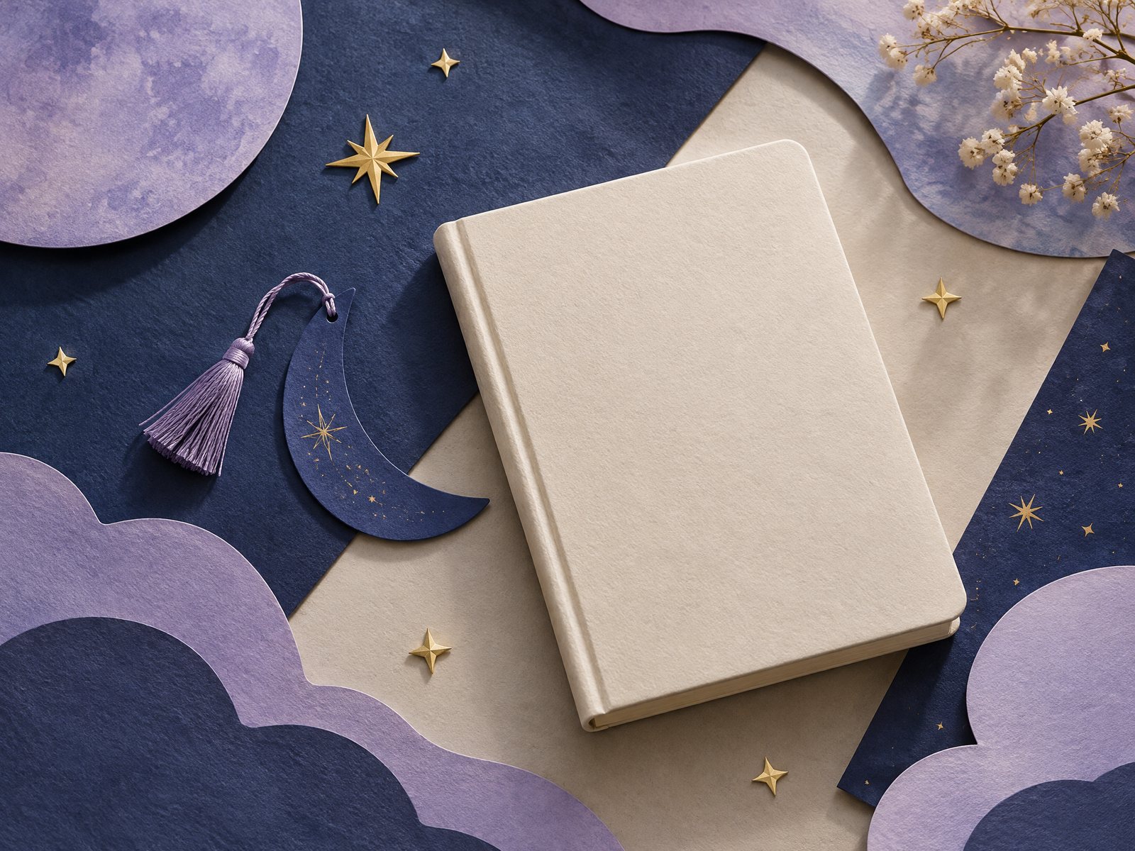
Moon and star shapes carry different visual weight even when they appear in the same illustration. A crescent tends to create a clear directional shape: its open curve can point toward a title, a date, or a margin. Stars are more rhythmic. A few widely spaced stars suggest calm; a crowded scatter creates energy. Clouds soften both motifs, while foil or bright contrast makes them feel more emphatic. Start by selecting one lead shape and one supporting shape.
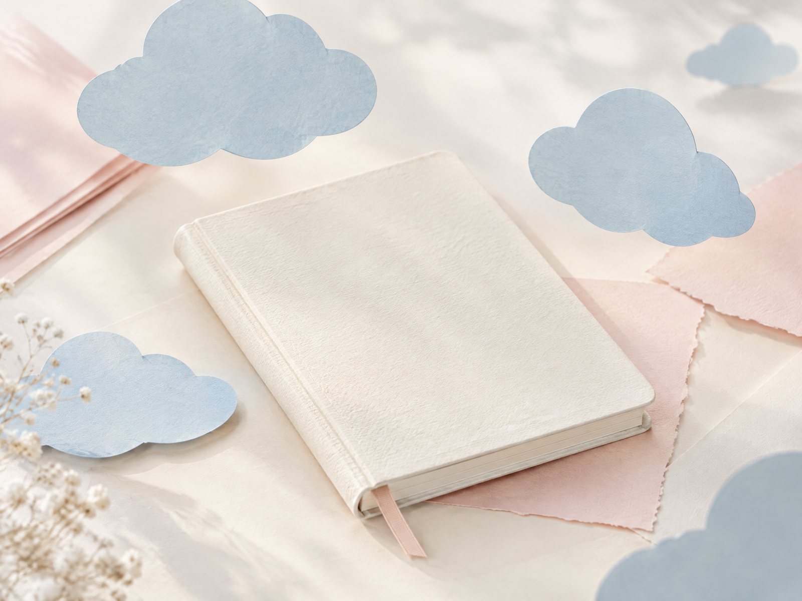
For a quiet reading or journaling edit, make the crescent the lead and keep the stars small. Use indigo, lavender, muted blue, or cream as the main color family, then reserve shine for one detail. For a softer dreamy edit, let clouds or gradients carry the background while stars act as punctuation. For a playful edit, reverse the hierarchy: use a cheerful star-and-cloud pattern as the main field and add one moon-shaped accent only where you want the eye to pause.
A quick paper test prevents an accidental mismatch. Place three scraps or product images beside the notebook you intend to use. Cover one at a time and ask: does the remaining pair still look related? If not, remove the loudest color rather than adding a fourth item. A celestial theme does not require every item to depict outer space. Shared color, repeated line quality, or a similar amount of open background can do the coordinating work.
Build a three-piece paper selection
A practical capsule begins with a functional anchor. The Starry Clouds Gradient Aesthetic Dreamy Memo Notepad is a 4-by-6-inch, 50-sheet pad with plain, non-adhesive paper. Its starry-cloud gradient can carry the theme while its memo format remains useful for quick notes, lists, or doodles. Because it is not sticky, treat it as a loose writing pad rather than a page marker. Keep it beside the notebook, or move a finished note into a folder instead of expecting it to cling to a surface.
Next, choose a smaller object that repeats the visual language without taking over. The Starry Clouds Cute Aesthetic Bookmark measures approximately 2 by 6 inches and is printed double-sided on glossy cardstock with rounded corners. It is a natural bridge between reading and stationery: the starry-cloud image can echo the memo pad while its vertical shape introduces a clean line. If glossy and matte surfaces appear together, let the bookmark be the only reflective element. That makes the shine feel intentional rather than busy.
For a third piece, the Pink Galaxy Silver Foil Washi Tape brings a soft pink galaxy motif with metallic silver-foil accents. The roll is 15 mm wide and 10 m long, so it can supply repeated narrow marks rather than one large block. Use one short strip on a notebook edge, a second strip to secure a loose note, or a pair of equal-length tabs on a divider. Do not wrap it around every available margin: the tape works best as a measured glint against the quieter starry-cloud pieces.
This trio has a workable hierarchy: the memo pad provides the broadest field, the bookmark provides a recognizable object, and the tape provides a fine accent. If your notebook already has a strong cover, omit the tape from the front and use it inside. If the notebook is very minimal, a single strip on the first page can announce the theme without turning the spread into a collage.
Browse the washi tape collection when you want to compare the celestial accent with other paper patterns, but keep your final selection limited. Collection browsing is useful for alternatives; it should not become an obligation to combine everything that shares a color.
Use scale and spacing to keep the page readable
Celestial designs often fail through scale rather than color. A large moon sticker beside a large star cluster leaves no visual rest. Instead, assign each element a job. One large shape can be the entry point, medium marks can guide the eye, and tiny stars can fill only the emptiest areas. On a notebook cover, place the largest shape away from the binding and leave a quiet strip near the edge. On a journal page, keep decorative marks out of the writing lane so the page remains functional after the novelty wears off.
Try a three-zone layout for a reading note. Put the title or book identifier in the upper third, reserve the middle for the actual notes, and place one small celestial accent near the lower corner. A crescent can sit beside the title if its open side faces the words; a star cluster can sit at the bottom as a visual full stop. This is a design choice, not a rule, so turn the page ninety degrees before committing if the composition feels top-heavy.
There is also a difference between repetition and clutter. Repeating one short strip of the Pink Galaxy tape at two locations creates a deliberate rhythm. Repeating five uneven strips creates noise. Likewise, one starry bookmark peeking from a book is legible at a glance; several bookmarks with competing backgrounds can make the shelf look unplanned. Keep a spare item nearby, but do not force it into the same arrangement.
For color, choose a dominant, a support, and a small accent. Indigo or lavender can dominate; cream or soft blue can support; silver or pink can accent. If the product colors appear different on your screen or in person, adjust by visual relationship rather than chasing an exact match. A slightly warmer paper can still belong if its value and pattern density are close. When the combination feels too sweet, remove the pink accent before removing the stars. When it feels too dark, add open cream space rather than another bright motif.
Three failure cases and their adjustments
Failure case one: the “night sky” becomes a pile of competing symbols. You have moons, stars, planets, clouds, and constellations in equal sizes. The eye cannot find a lead. Remove all but one supporting symbol and keep the strongest shape at the largest scale. If the page is still crowded, move one object off the page entirely and let it function on a nearby desk or inside a book.
Failure case two: the shiny element dominates the practical paper. Silver foil, glossy cardstock, and bright ink can pull attention away from a memo or reading note. Keep the Starry Clouds bookmark as the sole reflective feature, or use only a small strip of foil-accented tape. Place shine near an edge, not directly behind handwriting. The goal is a navigational cue, not a reflective background.
Failure case three: the theme feels childish when the user wanted calm. The issue may be motif density rather than the presence of stars. Reduce the number of marks, choose one muted color family, and leave more unprinted paper visible. A plain notebook with one gradient memo pad and one bookmark can read as restrained even when the illustrations are whimsical. Conversely, if the selection feels too severe for a gift, add a small cloud or pink accent rather than introducing an unrelated theme.
You can also test the selection in its real setting. Put the bookmark in the book you are reading, place the memo pad beside the keyboard or writing chair, and apply one removable-looking tape position only after checking the surrounding surfaces. Notice whether the colors disappear under the room’s light or whether the motif competes with the book cover. This is a visual check for fit, not a claim about durability or a substitute for product information.
A useful celestial edit remains flexible. Keep the bookmark available for reading, use the memo pad for temporary thoughts, and reserve decorative tape for moments when a page needs a small connection. If a motif stops feeling right, you can retire that piece without dismantling the entire selection. The strength of an editorial capsule is that each item has a role independent of the theme.
For more help coordinating paper goods, see How to Choose Stickers for Journals and Planners for selection principles, then compare it with How to Layer Clear Stickers on Journal Pages when transparency is part of your layout. If you are deciding between formats before browsing, Notebook Size Guide for Journaling, Lists, and Travel can help you match the scale of your writing space to the objects you want to use. To ask about current catalog availability or an order request, use Farouk Book Store’s contact page; the website’s bag prepares an email request, so inventory and order details should be confirmed rather than assumed.
Related reading: How to Choose Stickers for Journals and Planners · How to Layer Clear Stickers on Journal Pages · Notebook Size Guide for Journaling, Lists, and Travel