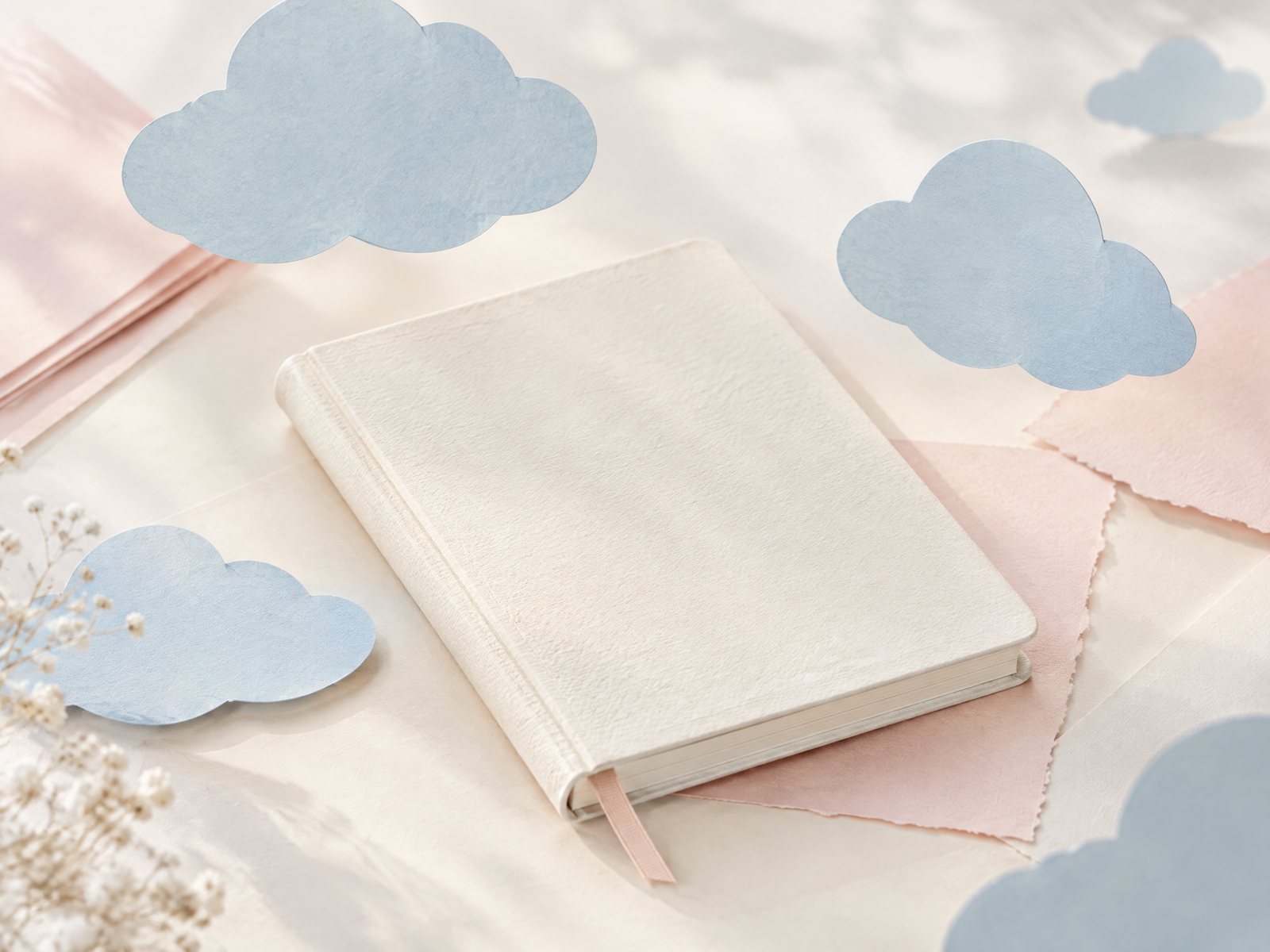
A cloud theme can become visually noisy fast: too many puffy shapes, too many blues, and no calm place for the eye to rest. If you want a journal page, note, or small paper arrangement to feel airy rather than childishly crowded, start with a limit. Farouk Book Store’s selection gives you a practical starting point for a quiet composition: one dominant cloud treatment, one supporting paper tone, and enough untouched surface to make both visible.
This is an editorial approach to motifs, not a claim that Farouk designed or manufactured every item in the catalog. Think of the shop as a source for assembling a paper mood. The goal is not to cover a whole page. It is to create a small visual pause with soft blue cloud shapes, ivory space, and perhaps a blush note of color.
Start with the empty space, not the stickers
Before choosing a motif, decide where the page will remain plain. Open your journal to a spread and lightly identify three zones: a writing area, a visual area, and a quiet margin. The visual area can sit in a top corner, drift along an outer edge, or cross the center only if your writing will remain legible. A cloud composition needs a visible horizon of blank paper; without it, the shapes lose their floating quality.
A useful first test is the one-minute thumbnail. On scrap paper, draw the page as a rectangle and mark only three or four small cloud silhouettes. Try one version clustered in the upper-left corner, one version moving diagonally from lower-left to upper-right, and one version anchored near the page edge. Compare the white space around each sketch. The strongest option is usually not the one with the most decoration, but the one that gives the eye a clear route through the page.
Keep the motif count deliberately low. Three larger shapes can feel more intentional than ten scattered pieces. If a sheet offers many individual stickers, you do not need to use them all in one sitting. Set the extras aside by color or scale. This prevents the common failure case in which a gentle cloud idea turns into a full-surface pattern before you have written a word.
Color matters, but contrast matters more. Soft blue cloud shapes against ivory paper create a restrained base. A blush accent can warm the page, provided it appears in only one or two places. If the journal itself is strongly colored, reverse the ratio: use fewer blue elements and let the page supply the background mood.
Choose a small cloud vocabulary
A coherent composition benefits from repetition with variation. Choose one cloud vocabulary before you start: rounded cloud silhouettes, sky-like clusters, or a cloud-and-star combination. Do not ask every piece to perform a different role. When a motif is quiet, consistency creates the sense of a collection even when the items come from different catalog categories.
For a sticker-led page, the Cloudy Skies aesthetic sticker sheet is a natural anchor in the selection. Its listing describes twelve individual stickers on a 4-by-6-inch sheet, with a soft matte finish and cloud-focused artwork. Use that information for planning the scale of your materials, but do not treat the entire sheet as a page layout. Select two or three stickers that share a visual weight, then leave the rest available for another spread or a small envelope.
A second option is to build the paper moment around writing rather than decoration. The Purple Gradient Clouds memo notepad is listed as a 4-by-6-inch, 50-sheet paper pad with cloud-like violet tones. The listing also notes that the pages are not adhesive. That distinction changes the composition: use a sheet as a loose journaling panel, a short note, or a removable color test rather than expecting it to behave like a sticky note. Its purple gradient can serve as the single shift away from blue-and-ivory.
For a reading-themed variation, the Starry Clouds bookmark introduces the motif vertically. Its listing describes an approximately 2-by-6-inch, double-sided glossy cardstock bookmark with rounded corners. Place it beside the journal while composing, not permanently across the page. The long shape can suggest a gentle downward drift while remaining a functional object for a book, planner, or reading journal.
These examples are choices, not a mandatory bundle. A quiet edit may use the sticker sheet alone. A paper-first edit may use a single notepad sheet and one blush card already in your supplies. The important decision is to give one item the lead role and let the others provide structure.
Layer paper without making a stack
Layering is useful when each layer has a different job. A blush paper strip can establish a warm base, an ivory journal page can provide the field, and a blue cloud sticker can supply the focal detail. If two layers have the same size and equal contrast, they may compete. Change one variable at a time: make the base wider, soften its color, or move it partly off the page.
Try this three-step arrangement:
1. Place a small blush rectangle or memo sheet so that one edge is visible but most of it remains beneath the writing area. 2. Add one blue cloud shape near, but not directly on, that edge. The gap is intentional; it keeps the cloud from looking pasted into a frame. 3. Add a second cloud farther away at a smaller visual weight. Leave at least one clear pocket of ivory between the two.
This is layering by relationship, not by piling stickers on top of stickers. The layers can remain separate on a desk, or the paper panel can become a temporary insert in a journal. If you are working in a bound book, test the placement near the gutter before committing. A thick cluster at the binding can make the spread feel lopsided and may interfere with comfortable closing.
A frequent failure case is the “cloud border.” Repeating identical shapes at equal intervals around every edge sounds tidy, but it removes the sense of open air and competes with handwriting. Correct it by erasing or lifting half of the border and retaining a single directional movement. Another failure is the “floating fragments” problem: tiny pieces sit far apart without a visual connection. Bring two closer together, remove one, or introduce a quiet blush bridge between them.
Do not mistake a glossy finish for a required focal point. If your composition already has a reflective bookmark or a shiny cover nearby, the matte sticker sheet may offer a calmer counterweight. Conversely, a glossy bookmark can be useful as the one crisp surface in an otherwise soft arrangement. Choose finish as part of hierarchy, not as an extra feature to display everywhere.
Make the theme fit the page’s purpose
A cloud motif changes character according to what surrounds it. On a reading-journal page, keep the decoration outside the main reflection area. A small cloud near a page heading can mark a new book without competing with your notes. Pair the bookmark with the journal only while planning, then return it to the book so the theme remains useful rather than purely ornamental.
For a short message, let the paper carry the atmosphere and keep the wording direct. A single memo sheet with one cloud accent can feel more personal than a heavily decorated card, particularly when the recipient’s taste is unknown. If you are preparing a gift, select motifs from something you actually know—perhaps a preferred color or a love of quiet stationery—rather than assuming that everyone wants a dreamy style.
For a planner, use the cloud as a category marker only if the same visual cue will remain understandable later. One cloud at the start of a reflection or rest block may be enough. Avoid turning every appointment into a decorative symbol; the page should still scan quickly. If the theme makes dates harder to find, reduce the motif count and keep it in a margin.
For a small desk scene or photograph, the composition can be more temporary. Lay an ivory journal, one blush paper layer, and two blue pieces on the surface. Move the items until the negative space feels intentional, then remove anything that merely fills a gap. A visual arrangement does not need to become a permanent journal layout to be successful.
Use the following check before you finish: Can you identify the focal cloud in one glance? Is at least one-third of the working area visually quiet? Does the blush tone appear as an accent rather than a second theme? Are the pieces connected by scale, color, or direction? If the answer to any question is no, take something away before adding something new.
The best adjustment is often distance. Move a cloud away from a title, widen the ivory margin, or shift the paper layer so only a corner shows. If the page still feels empty after that, add one small mark—not a new cluster. Restraint gives the motif room to read as an atmosphere instead of a pattern.
You can browse the broader stickers collection when you want to compare nearby visual directions, and the About page offers a place to understand Farouk Book Store as a shop with an editorial selection. If you need to clarify a product detail before making an order request, use the contact page; availability and order details should be confirmed rather than assumed from a listing.
Cloud-inspired paper does not require a complete makeover. Begin with a blank area, choose one cloud vocabulary, and let two or three pieces do the work. When the page has room to breathe, a small blue shape beside ivory and blush paper can become a deliberate pause—quiet, useful, and distinctly yours.
Related reading: How to Choose Stickers for Journals and Planners, How to Layer Clear Stickers on Journal Pages, and 2026 Stationery Trends: Color, Texture, and Joy.