Choosing a color palette for a small desk is less about following a trend and more about controlling what your eyes notice first. On a compact work surface, a few visible items can dominate the whole scene: a mousepad, a note pad, a pen case, a drink coaster, or a cluster of stickers. When those items compete, the desk can look crowded even when it is tidy. When they share a simple color logic, the same surface feels calmer and easier to use.
Start with the things you cannot easily change. Look at the desk itself, the wall behind it, the chair, your computer, and any lamp or storage that stays nearby. Treat those fixed colors as the background. Then choose one main color family, one supporting neutral, and one small accent. This three-part approach gives you room for personality without requiring every item to match exactly.
Start with the desk’s fixed colors
Take a quick photo of the desk in daylight, or place a sheet of plain white paper beside the objects you use most. The goal is not to judge the room; it is to identify the colors that are already taking up visual space. A pale wood top may already provide a warm tan background. A black monitor and keyboard may create a strong dark outline. A white wall may make bright accessories appear more intense.
Choose a base palette that works with those permanent colors. For a light wood desk, soft blue, sage, cream, or muted pink can add color without fighting the surface. For a white desk, almost any family can work, but you may need one darker item to give the arrangement definition. For a black or dark desk, lighter stationery can keep the surface readable, while one saturated accent prevents the setup from feeling flat.
Do not count every shade as a separate problem. A palette can include several nearby tones, such as pale blue, medium blue, and navy. What matters is the overall impression from a normal sitting distance. If your desk already has many dark objects, adding another charcoal accessory may disappear rather than coordinate. If everything is pale, a small deep-colored object can act as a useful visual anchor.
A practical test is to remove all decorative items for five minutes. Return only the objects you use every day. Notice which colors remain. Those colors should guide your choices more than an inspiration image from a different room. A palette that looks balanced online may feel too strong when your desk has a different finish, lighting level, or wall color.
Use a simple proportion for color
Once you know the background, divide your chosen colors by visual weight rather than by the number of products. A useful starting point is roughly 60 percent base color, 30 percent supporting color, and 10 percent accent. This is a flexible planning tool, not a rule to measure with a ruler. The desk surface and large neutral objects usually provide most of the base. Smaller stationery and one or two decorative pieces can carry the other colors.
For example, imagine a compact white desk with a pale blue supporting color and a coral accent. A blue mousepad can occupy a noticeable area, while a coral sticker or tab appears only in small moments. A white or clear pen holder keeps the base visible. If coral begins appearing on the mousepad, sticky notes, pencil case, and monitor stand at once, it stops being an accent and becomes a second dominant color.
Repeat a color at least twice when you want it to feel intentional. The repetitions do not have to be identical. A muted blue note pad and a darker blue sticker can connect the same scheme without looking like a matched set. On the other hand, one unusual color can be useful when you want a focal point. Place that single high-contrast item where you naturally look, such as beside your notebook, rather than scattering small high-contrast pieces everywhere.
When you are unsure, begin with a neutral plus one color. Cream and green, white and lavender, or gray and blue are easy combinations to adjust. Add a third color only after the first two feel comfortable in the actual space. This prevents a common small-desk problem: buying several attractive pieces individually and discovering that their combined colors leave no quiet area for reading or writing.
Match accessories to how you work
Color should support the desk’s tasks, not only its appearance. If you write lists throughout the day, keep the note-taking area visually quiet. A compact Blooming Records Sticky Notes pad can add a decorative color note while staying within a 3-by-3-inch footprint. Place it near the hand you use for writing, and keep the rest of the immediate work zone less patterned. If the design feels too prominent, turn the pad slightly or move it to a side zone used for reminders.
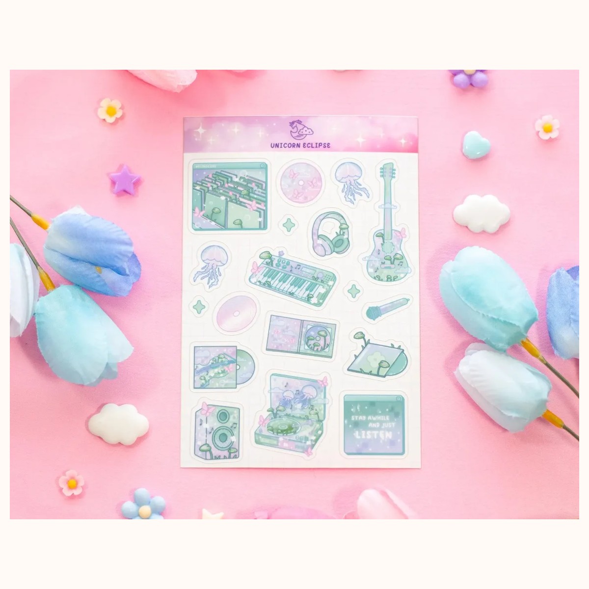
For a stronger graphic accent, consider the Blooming Records Sticker Sheet. Its 4-by-6-inch sheet contains 18 designs, so it can be used selectively instead of displayed all at once. Pick two or three stickers in your chosen accent color and place them on a notebook, storage box, or laptop case. Keeping the unused sheet in a drawer prevents a full sheet of varied motifs from becoming the visual center of a very small desk.
A mousepad is one of the largest colored surfaces on a compact desk, so select it before tiny decorations. A cloud or rain motif can set the mood for the whole arrangement. For example, the Starry Clouds Cute Mousepad measures 8 by 9.5 inches. Use its visible colors as the starting point for nearby notes, pens, and stickers rather than trying to match every shade exactly. If the pad already has a detailed illustration, pair it with solid or lightly patterned items.
A coaster can connect the desk to the rest of the room without taking much space. Choose one color from the mousepad or notebook, not a completely new hue. If a coaster feels visually loud, put it at the back corner or select a calmer item from the accessories collection. Keep drinks away from paper where practical, and treat the coaster as a placement tool as well as a decorative object: it can define a small refreshment zone so cups do not drift into your writing area.
Test, edit, and troubleshoot the palette
Do not decide from a product page alone. Colors can look different under warm lamps, daylight, and a monitor’s glow. Before committing to a group, gather objects you already own and arrange them on the desk for one working session. Use a notebook or scrap paper to cover items temporarily. This lets you see whether the palette still works when the desk is occupied, not only when it is styled.
If the desk looks busy, remove color before removing function. Put away extra sticker sheets, spare pens, and decorative paper first. Keep the items that support your routine. Then identify the loudest remaining object. It may be loud because of brightness, contrast, pattern, or size. Move just that item to the edge and check whether the surface feels calmer. If it does, the issue is placement rather than the entire palette.
If the desk looks dull, do not immediately add several new colors. First introduce contrast in one controlled way. A darker pen, a small saturated sticker, or a colored memo pad may be enough. Repeat that accent once elsewhere if the first item feels isolated. If the setup still looks flat, change texture or pattern rather than hue: a matte paper note beside a smooth device can create interest without adding visual noise.
If colors look mismatched, check temperature. Warm colors such as peach, coral, and mustard can feel different from cool colors such as blue, lavender, and blue-green. Mixed temperatures can work, but one should usually be clearly secondary. A warm wood desk with icy blue accessories may need a cream or dusty blue bridge. A cool white desk with orange accents may benefit from a soft gray or beige transition. Move objects into daylight before deciding that they clash.
If the desk feels smaller after decorating, preserve a clear working rectangle in front of your keyboard or notebook. Push display items toward the back or corners, and avoid placing several small objects in a line across the front edge. A compact palette works best when it protects empty space. The goal is not to fill every visible area; it is to make the useful areas easy to find.
Finally, photograph the arrangement from the doorway and from your normal chair. The chair view tells you whether the palette is comfortable while working. The wider view shows whether the desk belongs with the surrounding room. Keep the pieces that look good from both angles, and move or store the rest. You can revisit the accent color seasonally without replacing the whole setup.
A successful color palette for a small desk is therefore a working system: fixed colors establish the background, one family carries the mood, a neutral creates breathing room, and a restrained accent adds character. Start with the largest visible accessory, repeat colors thoughtfully, and edit according to how the desk is actually used. For product details or help verifying current catalog information, use the store’s contact page.
Related reading: How to Choose Stickers for Journals and Planners, 2026 Stationery Trends: Color, Texture, and Joy, How to Build a Personalized Gift Bundle