Good suncatcher window placement is less about finding the brightest-looking window and more about matching the decal to the way sunlight actually moves through your room. A window can feel sunny at breakfast but sit in shade by mid-afternoon; another may receive a short, intense beam that creates vivid color for only a few minutes. Before applying anything, watch the light, identify where you want the reflections to land, and leave room to adjust.
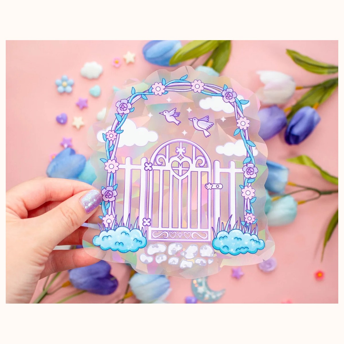
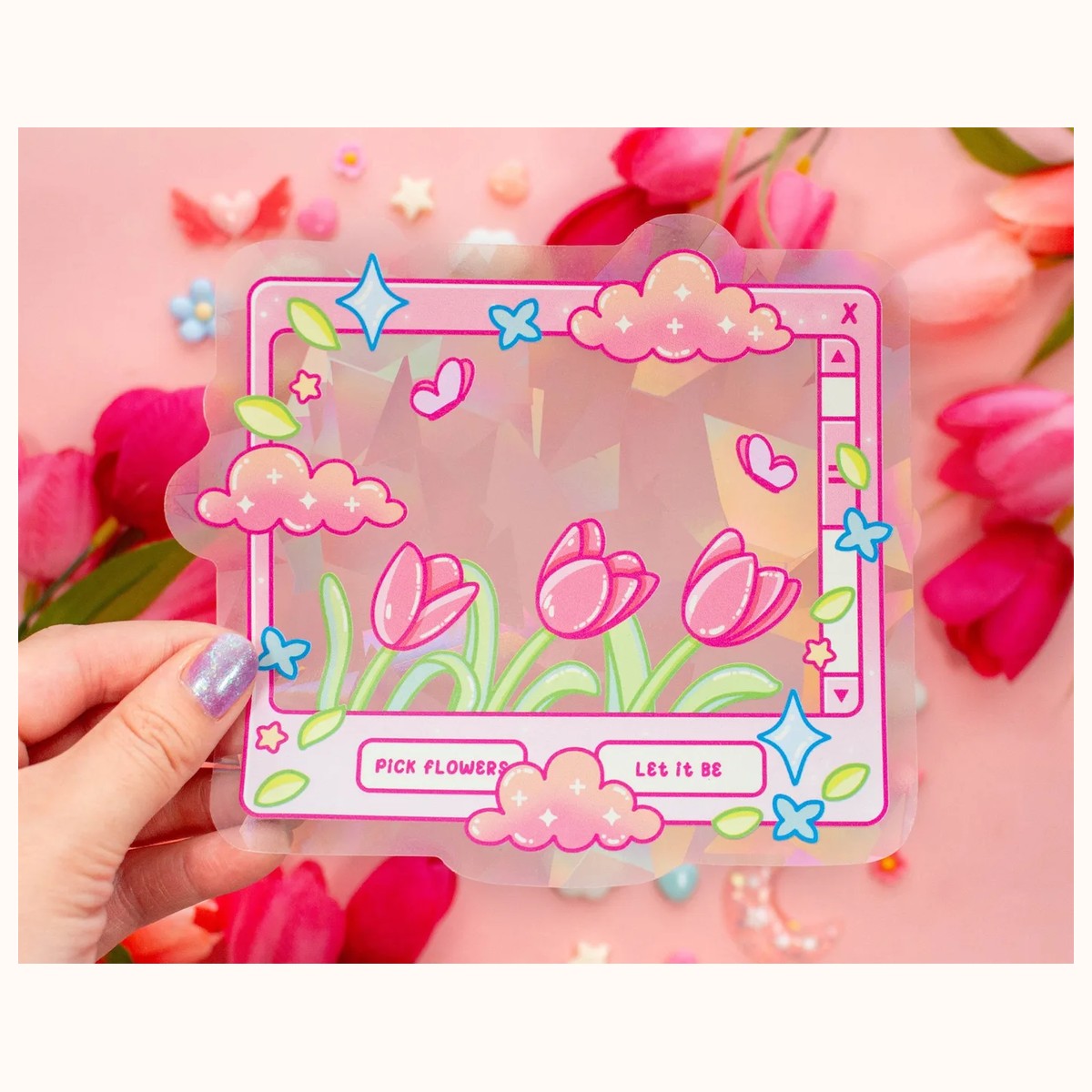
This guide focuses on removable window decals and rainbow-making suncatchers. It will help you choose a pane, decide on height, protect visibility, and troubleshoot results without treating any one position as universal. For inspiration, browse the Suncatchers collection, including the Tulip Dreams Suncatcher Sticker | Rainbow Maker Window Decal and Secret Garden Gate Suncatcher Sticker | Rainbow Maker Window Decal.
Start with the light your room actually receives
Observe before you commit
Spend one ordinary day checking the intended window at several times: early morning, midday, late afternoon, and evening. Note whether direct sun reaches the glass or whether the pane is only bright with indirect daylight. A suncatcher may look attractive on any bright window, but colorful projections are more likely when sunlight travels directly through the decal.
Use a small piece of removable tape to mark promising areas temporarily. If a beam crosses the wall at 9 a.m. but disappears by 10 a.m., decide whether that brief effect suits the room. A breakfast nook may benefit from a quick morning shimmer, while a reading corner may be better served by the longer, gentler light available later in the day.
Think about the destination of the color
Look through the window from inside and identify nearby surfaces where a moving patch of color would be welcome. A pale wall, open floor, curtain, or side table can make the effect easier to notice. Dark furniture may absorb some visual impact, while a glossy tabletop can create distracting glare. Keep projections away from screens if reflected light makes text difficult to read.
The most useful test is simple: hold the decal, or a paper cutout of a similar size, against the glass while sunlight is present. Watch where the light travels as you move it up and down. A higher position can send color farther across the room; a lower position may create a smaller, more noticeable patch near a desk or plant. The best choice depends on the view you want, not on a fixed “correct” height.
Account for changing seasons
Sun angles change over the year. A placement that receives direct light in one season may receive only diffuse light later. If you want a consistent decorative accent rather than a specific daily rainbow, choose a position that still looks balanced when the beam moves. If your priority is maximum color at a particular time of year, use the removable nature of a suitable decal to reposition it when the light pattern changes.
Choose the right pane and height
Favor direct exposure, with practical limits
For stronger color, start with the pane that receives direct sunlight for the longest useful period. South-, east-, or west-facing windows may behave differently depending on nearby buildings, trees, balconies, blinds, and local surroundings, so orientation alone cannot decide the placement. A shaded east-facing pane may produce less direct light than an unobstructed window facing another direction.
Avoid placing the decal behind a permanently closed blind, dense curtain, or window film that blocks or softens the sun. A sheer curtain can still be attractive, but it may diffuse the beam and reduce crisp reflections. If the window is opened often, place the decal where it will not catch on the frame, latch, insect screen, or curtain movement.
Set a viewing height
Eye level is not always the best height. A decal placed in the center of the pane may be easy to see from the room but may cast color directly into eye level, which can feel distracting. For a living room, the upper third of the glass often keeps the design visible while sending light onto a wall or floor. In a compact bathroom, a centered or slightly higher position can brighten the pane without interfering with privacy habits.
Measure the clear area first. The Tulip Dreams decal is listed at approximately 5.4 by 6 inches, while Secret Garden Gate is approximately 5.2 by 6 inches. Those dimensions are manageable for a small pane, but handles, mullions, stickers, and textured glass can reduce the usable surface. Leave a little visual breathing room around the decal so it does not look crowded against the frame.
Balance color with the view
A suncatcher should enhance a window rather than make it awkward to use. Keep handles, locks, ventilation gaps, and frequently cleaned edges accessible. If the window is at a desk, place the decal to one side so the design and reflections do not sit directly behind your monitor. If the window overlooks a busy street, a corner placement can add color while preserving most of the view.
For a pair of windows, resist automatically placing one decal at the same height on each pane. Compare the sunlight on both sides first. Matching heights can look orderly, but staggered placement may produce more interesting reflections if one pane receives a different angle of light. Use paper markers to preview both options before applying either product.
Apply and adjust for the best result
Prepare a clean, smooth surface
Clean the inside of the glass according to the window manufacturer’s care guidance, then let it dry fully. Dust, oily fingerprints, condensation, or leftover cleaner can create bubbles and make repositioning less predictable. A smooth pane is usually easier to test than textured glass, frosted glass, or a surface covered with condensation.
Follow the product’s own application instructions rather than assuming every decal uses the same method. The catalog descriptions for both featured suncatchers identify them as removable and replaceable, which makes experimentation practical, but removable does not mean every surface or temperature will behave identically. Peel and reposition slowly, keeping the decal supported so it does not fold onto itself.
Test one variable at a time
If the result is weak, do not immediately move the decal across the room and change its height at the same time. First shift it a few inches toward the brightest portion of the pane. If color improves, the issue was likely the light path. If it does not, try a different time of day, then a different window. Keeping notes—“brightest at 11 a.m.,” “wall projection at 2 p.m.”—helps you make a clear decision instead of guessing.
A phone camera can help compare positions, but do not treat a photograph as a precise color test. Cameras adjust exposure and white balance, and screen settings alter how colors appear. Judge the effect in person, especially if your goal is a gentle decorative glow rather than a dramatic projection.
Consider safety and daily use
Keep the decal away from places where it could obscure a safety sign, emergency exit view, or important visibility line. Do not place any window decoration where it interferes with a child’s access to a window, a secured opening, or a blind cord. In a rental or shared space, verify that the chosen surface permits removable decorations and test a discreet corner if you are uncertain.
Direct sun can make any room warmer or create glare, even when the decal itself is small. If a projection lands on a television, monitor, artwork, or polished surface, move the decal slightly rather than tolerating the distraction. A few inches can redirect the reflection while preserving the overall composition.
Troubleshoot weak color, glare, and shifting patterns
“The decal looks pretty, but no rainbow appears”
First confirm that direct sunlight is crossing the glass. Bright overcast daylight may illuminate the design without producing the same colorful projection. Next check for shade from a tree, neighboring building, exterior awning, or interior curtain. Clean the pane, wait for a stronger beam, and test a location closer to the sunlit portion of the window.
If the window receives only indirect light all day, choose placement for the decal’s visual appearance rather than promising a strong rainbow. The Secret Garden Gate description specifically recommends a clean window receiving direct sunlight for refraction, so treat that as a practical condition, not a guarantee for every room.
“The color lands in the wrong place”
Move the decal vertically before moving it to another window. Raising it may send the projection farther across the floor or wall; lowering it may bring the color closer to the pane. A small sideways shift can move the projection away from a screen or reflective tabletop. Recheck at the time you care about most, because the sun’s angle changes throughout the day.
“The effect is too bright or distracting”
Try a less central position, a higher placement, or a pane with shorter direct exposure. You can also choose a wall where the reflection is visible but not in a main sightline. If glare remains troublesome, temporarily remove and store the decal according to its care instructions, then reinstall it when the room layout or season changes.
“The decal will not stay or looks uneven”
Check whether the glass is damp, dusty, unusually textured, or coated with a product that affects adhesion. Re-clean and dry the surface, then reapply carefully. Avoid forcing a corner that repeatedly lifts. For questions about a particular order, surface, or product detail, use the store’s contact page so the relevant item can be verified directly.
The most successful placement is the one that fits your actual routine: the light is visible when you want it, the window remains functional, and the color adds interest without creating glare. Start with a paper test, choose direct but usable sunlight, and make small adjustments until the room—and not just the glass—feels right.
Related reading: How to Build a Personalized Gift Bundle · 2026 Stationery Trends: Color, Texture, and Joy · Why Small Gifts Create Big Connections