
A reading journal can be a record of what you read, but it can also be a small visual pause between books. Bookish stickers for reading journals help you mark themes, frame a quote, signal a rating, or simply make a page feel like yours. The trick is not to cover every empty space. A good layout gives stickers a job, leaves room for writing, and makes the page easy to revisit months later.
This guide is for paperback notebooks, reading logs, commonplace books, and digital-layout inspiration translated onto paper. You will learn how to choose a visual plan, place stickers without losing writing space, combine sheets with individual designs, and repair a spread when the first idea does not work.
Start with the page’s reading purpose
Before opening a sticker sheet, decide what the spread needs to hold. A monthly reading log may need several small book titles and dates, while a one-book review may need space for plot notes, favorite lines, and a personal response. Sticker placement should follow that purpose rather than compete with it.
Try one of these three simple layouts:
- The record page: Reserve the largest area for title, author, date finished, and a short rating. Use a narrow sticker strip along one edge as a visual index.
- The review page: Put your review heading near the top, then keep a generous writing block below. Use one larger sticker in a corner to establish the mood without interrupting the paragraph.
- The theme page: Group notes by motifs such as rain, travel, food, friendship, or mystery. Use stickers as category markers, with a consistent symbol beside each theme.
Lightly pencil the zones before sticking anything down. A useful rule is to outline the writing area first, then treat the remaining margins as the decoration zone. If you often write in large letters, widen the margin; if you record only short reactions, a balanced border can use more of the page.
You can also assign a visual meaning to recurring sticker types. For example, a cloud can indicate atmosphere, a computer can mark a screen adaptation, and a mail-themed image can signal a book discovered through a recommendation. Keep the system modest: two or three meanings are easier to remember than a complicated code. Write a tiny key inside the back cover if you want consistency across several notebooks.
Build a balanced sticker hierarchy
A spread usually feels calmer when stickers have different levels of visual importance. Choose one anchor, a few supporting accents, and optional tiny fillers. The anchor attracts attention; the accents guide the eye; fillers close awkward gaps only when the page genuinely needs them.
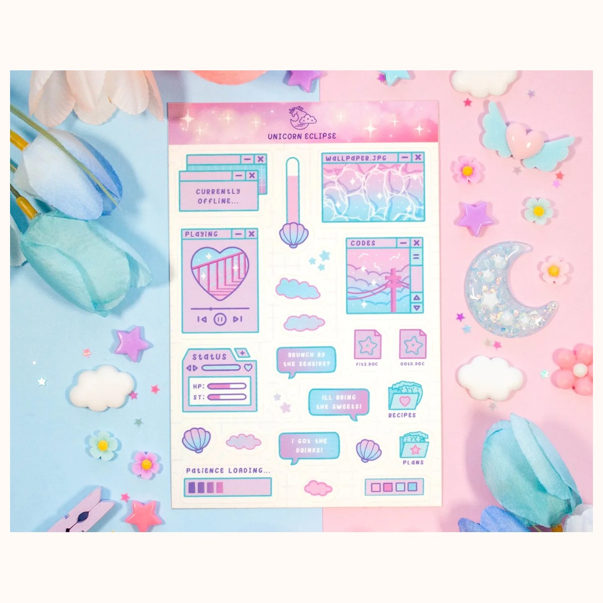
For an airy page, consider the Stickers collection as a starting point. A real catalog example is the Cloudy Skies Aesthetic Sticker Sheet, a 4-by-6-inch sheet with 12 individual designs and a soft matte look. Its cloud imagery can serve as an anchor for reflective reading notes, or its individual pieces can be distributed across several spreads. If you want more choices in one compact sheet, the Blue Computer Sticker Sheet contains 23 stickers and can support a technology, study, or contemporary-fiction theme.
Use scale deliberately:
1. Place the largest design first, usually near a corner or at the end of a heading. 2. Add two or three medium accents on the opposite side or along a diagonal path. 3. Stop and view the page from arm’s length. Only add tiny stickers if a blank area looks accidental rather than restful.
Asymmetry often feels more natural than matching stickers in all four corners. A large cloud at the upper right can be balanced by two small stars at the lower left. If the page contains a long review, place decoration outside the text block so the eye moves from heading to notes without jumping over images.
For a softer reading journal, combine one illustrated sheet with plain handwriting and one ink color. For a more energetic spread, repeat a color or shape three times. Repetition creates cohesion even when the sticker subjects differ. Avoid making every element equally bright or equally large; that removes the visual hierarchy and makes the page harder to scan.
Place, layer, and write without regret
Test placement before removing the backing. Set stickers on the page, take a quick phone photo if helpful, and read the spread as if it were finished. Check the gutter, page edges, and any lines you plan to write on. A sticker that looks perfect near the binding may become inconvenient when the notebook is opened flat or turned quickly.
Keep important information away from the outer edge. Titles, ratings, and quotations should have a small breathing margin so they do not disappear into the fold or get trimmed visually by the cover. If you use a sticker as a label, leave enough clear space beside it for a date or one-line explanation.
Layering works best when each layer has a visible purpose. You might place a small sticker over the corner of a larger paper shape to create a tab, or overlap two accents slightly to connect separate notes. Do not stack stickers over words you may want to revise. For a removable visual test, use a scrap of similar paper first; adhesive behavior can vary by surface, finish, and age.
A practical order is:
- Write pencil guidelines and headings.
- Add any permanent ink, then let it dry fully.
- Place the anchor sticker.
- Add supporting stickers while checking the negative space.
- Finish with dates, ratings, or a small key in pen.
If you want to write on a sticker, check its surface before committing. The catalog description for the Blue Computer Sticker Sheet recommends Sharpies and ballpoint pens, but ink still benefits from a brief drying pause. Test a tiny corner when using a different pen, and avoid pressing wet ink against the facing page.
Not every page needs a sticker in the margin. A sticker can act as a section divider, sit beside a quote, or mark the start of a new month. Leave a few spreads quieter so a highly decorated review feels intentional rather than routine.
Troubleshoot common layout problems
Problem: The page feels crowded. First identify the least useful sticker, not the prettiest one. If you have not pressed it firmly, lift it carefully; otherwise cover part of it with a small label or let it become a background detail. Move one or two notes to the next page instead of shrinking your handwriting to fit.
Problem: The spread looks disconnected. Repeat one color, motif, or shape in at least two locations. A city-themed accent at the top can be echoed by a small night-sky piece near the final paragraph. You can also draw a thin border or underline in the same ink as a sticker detail, keeping the connection simple.
Problem: There is a blank area that feels accidental. Do not fill it immediately. Add the next reading entry, a two-line “would I reread it?” note, or a small date label first. If the space remains distracting, use one small accent rather than a cluster. Blank space can separate a review from the next record and improve readability.
Problem: The sticker dominates the writing. Treat it as a movable design decision, not a failure. Crop the visual effect by placing the sticker partly under a page edge, title card, or note layer, or relocate it to the back matter as a “currently reading” marker. For future pages, choose one anchor size smaller.
Problem: Pen marks smudge or disappear. Allow ink to dry and test the pen on a spare sticker or nearby scrap. Matte and glossy surfaces can accept writing differently, and a writing tool that works on one design may not behave the same on another. Keep a thin strip of removable paper over a fresh note if your journal closes before the ink sets.
Problem: The spread does not match the book’s mood. Use contrast on purpose. A playful sticker beside a difficult review can acknowledge the reading experience without pretending the book was cheerful. If the mismatch bothers you, move the sticker to a monthly index and use a quieter accent beside the review.
Finally, photograph finished spreads before adding more. The photo reveals crowded corners, uneven visual weight, and headings that are difficult to find—issues that can be hard to notice while working close to the page. For product details, current catalog availability, or questions about a specific item, check the Stickers collection and use Farouk Book Store’s contact page for verification.
A useful reading journal is not measured by how many stickers it uses. It succeeds when you can locate a book quickly, remember why it mattered, and enjoy opening the page again. Start with a purpose, establish one visual anchor, protect the writing space, and let the final accents earn their place.
Related reading: How to Choose Stickers for Journals and Planners, Vinyl vs. Paper Stickers: A Complete Guide, Best Stickers for Scrapbooking: A Creative Guide