A small dinner has a particular problem: everyone needs to know where to sit, but a formal-looking place setting can make a relaxed meal feel overproduced. Add dietary preferences, mobility considerations, unfamiliar guests, or a table that needs to change at the last minute, and a tiny card suddenly has a lot of work to do. Farouk Book Store’s paper selection offers a practical starting point for making place cards that are clear, adjustable, and still personal.
This is not a birthday-label project and it does not require elaborate calligraphy. Think of it as a four-to-eight-card paper exercise for an informal meal: choose a card format, decide what information is genuinely useful, and build a visual system that can change when a guest’s preference changes. The result should help people settle in rather than announce a performance.
Start with the table, not the decoration
Before choosing a color or writing a name, look at the table as a route through the meal. Where does a chair pull out? Which seat has the clearest access? Is there enough room for a person who needs to shift a chair, use a mobility aid, or avoid reaching across a centerpiece? A place card cannot solve every access issue, but it can support a better decision about seating.
For a very small dinner, make a quick pencil map on scrap paper. Draw the table, mark the serving area, and note seats that are easier to enter or leave. Then ask guests privately, in ordinary language, whether they have seating preferences. Do not print a medical explanation on a card or make an assumption from appearance. A discreet question such as “Is there a seat that works better for you?” gives the guest control without turning the table into an announcement.
Keep the information on the finished card minimal. Usually, a name is enough. If the seating arrangement needs a gentle cue, use a small symbol or a short neutral word that the host understands, rather than a public note about a person’s needs. If a guest prefers not to use a place card, leave it off or make the card movable. Participation should be easy, not compulsory.
The card’s physical placement matters as much as its wording. Put it where it can be read without moving a glass, crossing a plate, or blocking a setting. If the table is narrow, stand the card at the outer edge of the setting instead of tucking it between dishes. If glare or low light could make small writing hard to read, choose a darker pen, larger lettering, and strong contrast. Legibility is more useful than ornate lettering.
Choose a flexible paper format
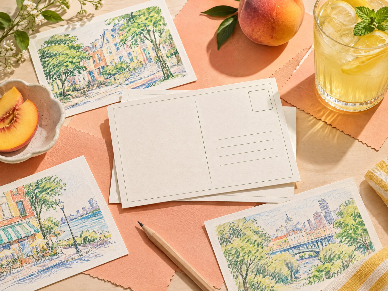
For a compact project, index-style note cards are especially adaptable because they can be written, folded, repositioned, or replaced without rebuilding the whole table. The Pastel Academia Note Cards come as a 50-card bundle in a 3 in x 5 in format, with one ruled side and a blank reverse on 14 pt matte paper. That gives you a ruled face for names and a blank side for a tiny hand-drawn mark, a menu cue, or a color block. You do not need to use all 50; the extra cards make it easy to redo a smudged name or adjust the plan after a seating conversation.
If you want the same dimensions with a quieter reading-oriented mood, Reading Room Note Cards also provide 3 in x 5 in cards with a lined side and a blank reverse. Use the lined side for consistent names, then reserve the blank side for a simple visual code: a green dot for the end seat, a small leaf for the side near the serving space, or no mark at all for guests who prefer an understated setting. Farouk is presenting an editorial selection here, so treat these as available paper options rather than as a claim that the shop manufactures every design in its catalog.
A third option is a small removable cue made from Blooming Records Sticky Notes. Each pad contains 50 adhesive 3 in x 3 in sheets. They can act as temporary planning slips while you test the arrangement, or as a separate note for the host’s seating map. For a guest-facing place card, however, test the adhesive and placement first. A sticky note on a fabric napkin, textured surface, or valuable table item may not behave as expected. When in doubt, use the note as a planning tool and put the final name on a freestanding card.
Browse the note cards collection when you want to compare the paper formats available for this kind of small project. The right choice is less about matching every object and more about having a surface that stays readable, can be replaced, and does not force a single decorative theme on every guest.
Build one small visual system
A coherent set does not mean identical cards. It means each card follows the same few rules. Decide on one writing color, one name position, and one optional mark. For example, write every name in dark green near the top third of the card, then add a thin line below it. Or write names in black and use one muted accent color only on the reverse. Limiting the decisions keeps the table calm and makes last-minute replacements easy.
Here are three useful directions for a four-person dinner:
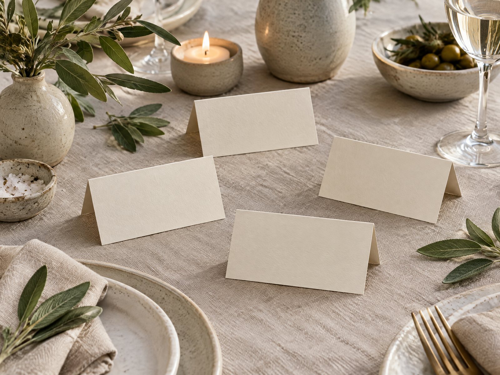
- Quiet and open: Use cream cards, large dark lettering, and no illustration. This is the most adaptable choice when guests have different visual preferences or the table already has flowers, patterned dishes, or colorful food.
- Soft botanical cue: Add one small leaf outline to every card, varying the leaf direction rather than the guest treatment. Keep the drawing near the edge so it never competes with the name.
- Conversation-friendly cue: Put a tiny original question on the blank reverse, such as “What have you been enjoying lately?” Keep it optional and avoid printing a prompt where a guest may feel expected to perform for the table.
Make one test card before preparing the set. Place it at the actual table, turn on the lighting you expect to use, and view it from the doorway and from the seat. If the name disappears into the background, increase letter size or remove the decoration. If the card feels too formal, take away the border rather than adding more casual graphics. If the table is visually busy, let the paper be plain.
A common failure is treating every guest’s card as a miniature portrait. Four different colors, four lettering styles, and four unrelated motifs may sound personal, but they make the table difficult to scan. Another failure is using a clever nickname without checking first. A place card is public enough that a joke can become uncomfortable. Use the name the guest actually wants to see, including accents or a chosen short form.
Prepare for changes without making a fuss
An informal dinner is allowed to change. Someone may arrive late, swap seats, bring an unexpected guest, or ask to sit nearer the door. Keep two or three blank cards nearby, along with the pen used for the original set. Do not write every card in permanent ink before the seating plan is settled. A light pencil draft followed by final lettering once guests confirm is a simple safeguard.
Separate your planning materials from the guest-facing cards. A host’s map can include practical reminders such as “leave space for serving bowl” or “keep this path clear,” but those notes do not belong on a guest’s place card. This separation also protects privacy if another person helps set the table. If a guest changes seats, move the card with the guest rather than making the person explain the change.
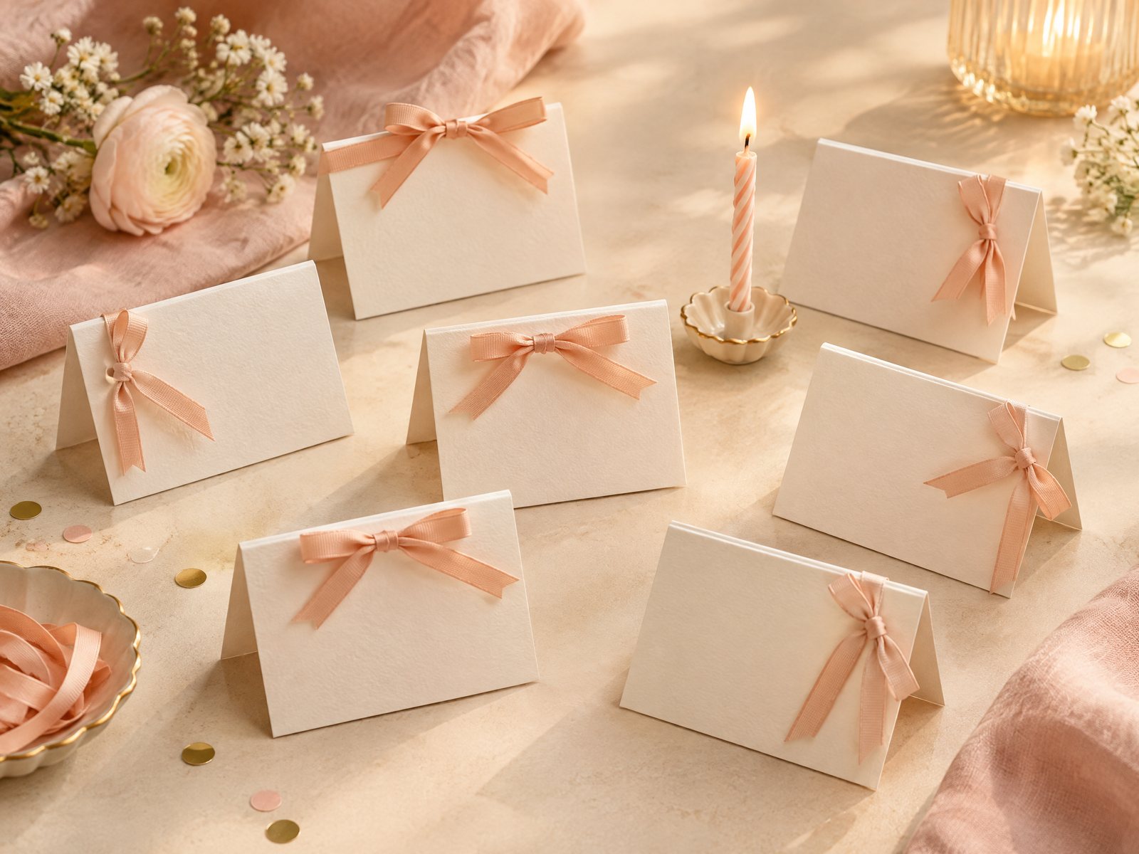
Consider height and reach when arranging the rest of the setting. A tall folded card may hide the person opposite it or block a shared dish. A flat card can be easier to read from some angles, while a folded tent is more visible in a dim room. Test both with an empty plate and the actual napkin. If the card tips over, widen the fold or place it beside—not on top of—the setting. Do not rely on a tiny card staying upright against a full glass.
After the meal, collect the cards before wiping the table. Reuse blank or lightly marked cards for another gathering, or keep the unused cards with your stationery rather than treating the project as disposable decoration. If you are ordering from Farouk, remember that the site’s bag prepares an email order request rather than functioning as a payment checkout; inventory, taxes, and shipping need confirmation. For questions about the shop or catalog, use the Farouk Book Store about page rather than assuming details that are not stated.
The finished project should feel almost invisible in the best way. Guests can find their seats, the host can adjust the arrangement, and the paper adds a small note of welcome without turning a casual dinner into a ceremony. A consistent format, readable names, private preference checks, and a few spare cards are enough. Decoration can follow, but it should never outrank access, clarity, or the comfort of the people around the table.
Related reading: How to Write a Thank-You Note That Feels Personal, Envelope Sizing for Note Cards and Small Paper Gifts, and Stationery Care and Storage in Warm, Dry Climates.